
 Request a study
The Well-Known Criteria for a Successful Brand Name Are the Following:
- Easy to pronounce and understand.
- Doesn’t contain strange, unusual sound combinations or letters.
- Associatively linked to what it refers to (the product or service).
What Perceptual Principles Underlie These Rules, and Do They Always Apply?
Cognitive Ease.
Cognitive ease is an assessment of the mental resources your brain needs to spend on processing information in order to understand it. For instance, a STOP sign is perceived with the least amount of cognitive resources, while program code requires the most.
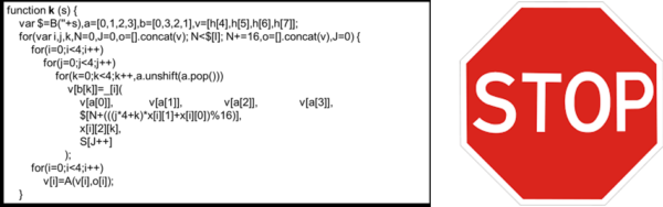
Names that are perceived easily are rated more positively and, as a rule, turn out to be significantly more effective. There is research showing that companies with simple, euphonious names perform better on stock exchanges (for instance, BAL outperforms BDL). Compare Apple and IBM.
However, sometimes increasing a brand name’s cognitive complexity can actually be beneficial. If a name is perceived as more complex, in Daniel Kahneman’s terms we need to engage System 2 — rational processing. This can have a positive effect for a brand if you want to emphasize its distinctiveness, its differences from others.
For instance, Häagen-Dazs has increased perceptual complexity, including the umlaut, but this brought the company success. At the time the brand was born, its creators wanted to emphasize its distinctiveness and exotic quality. Yet few of the brand’s consumers can write its name from memory without making a mistake.
Increased cognitive complexity can work well for premium, niche brands, underscoring their exclusivity, the complexity of their production, and their limited availability.
If you’re looking for a name for a mass-market product, favor names that are easy to understand, pronounce, and write.
The associative links between a name and what it refers to have a pronounced effect. A well-known example is KIKI and BOUBA. Below you see two shapes. Which one, in your opinion, is called KIKI, and which one is BOUBA?

The overwhelming majority believe that the sharp-angled shape is KIKI, and the rounded one is BOUBA. In this way, a name sets up how something is perceived.
It’s generally believed that for services it’s better to choose names with a soft sound profile (BOUBA), while for technological, innovative products, a sharper one (KIKI) works better.
A recent study on the perception of brand names uncovered yet another phenomenon related to how names are pronounced. When we pronounce a word, we perform articulatory movements — for instance, the consonant K is a back-palatal sound, while B is a labial one. Researchers identified a relationship between articulatory movements and the perception of brand names.
If, while pronouncing a word, the articulation moves from labial and front-palatal movements toward back-palatal ones, this is perceived more positively. This effect has been named the In-Out Effect. Accordingly, the name IBOOK is perceived more favorably than KIDUB (try pronouncing them and pay attention to your own articulation). Names with the In-Out Effect are perceived as friendlier, more emotional, and as promising more enjoyment. This effect has less influence on the perception of expertise and competence.
The In-Out Effect has been confirmed in studies looking at the relationship between seller names and popularity on EBAY.
Note that sound characteristics matter mostly for new names, since well-known brands that have already earned their place in the sun are, to a large extent, perceived on the basis of already-formed associative links, which means articulatory characteristics carry less weight for them.
Typographic rendering also has a certain influence on how a name is perceived. First, the same principle of cognitive ease applies here:
a simple typeface is processed more easily and perceived more positively, while a complex one requires additional resources and suits niche brands better.
There’s Yet Another Phenomenon in How Names Are Written: BRAND NAME or brand name?
Uppercase or lowercase?
The choice of lettering influences attitudes toward a product and the intention to buy it. There’s a gender-specific pattern in perception:
uppercase letters are perceived as masculine, more aggressive, authoritarian;
lowercase ones — as feminine, friendlier, lighter.
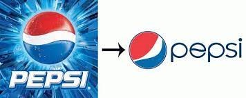
For instance, if you’re selling vitamins for pregnant women, it’s better to write “vitamins”, whereas if it’s for winning a marathon, it should be “VITAMINS“.
When Pepsi switched its lettering from uppercase to lowercase a few years back, what effect do you think they were aiming for?
We hope our insights help you choose the right and successful name for your brand, but remember that every rule has its exceptions, and let our recommendations serve as a helping hand for you, not a rigid mold to fit into.
 Contact Us